which oz is ours?
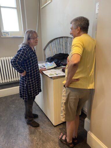
This is a guest blog post by set designer Kairiin Bright in which she describes the process and the end product she arrived at while designing the set for Humm Team Productions’ November 2024 show The Wizard is…Odd?
~~~~~~~~~~
As a set designer, you get to create the visual world of the play. From an actor’s perspective in this production, The Wizard of Oz is a relatively minor element—this show is really about community theatre and the roller coaster of despair and elation that goes with mounting a production. For the set designer though, all of the scenic elements come from the Wizard of Oz.
What Oz is this? Is it the Oz of L. Frank Baum’s original novel, published in 1900? This novel was a huge success beyond anyone’s wildest dreams—it was the Harry Potter of its day and the illustrations by W. Denslow were turned into marketing images for dozens of popular products. The author had intended the book as a one-off, but its incredible success made the publisher push Baum to write 13 sequels over the next 20 years. He also switched illustrators and some of the later artwork was more inviting to me as I searched for a “look” for our play.
What about the 1939 movie entitled The Wizard of Oz? It is still the third most-watched movie of all time! The pictures most people carry in their heads about the world of Oz come from this movie, rather than the original novel. So, should this be my main visual source?

Then I took another look at the poster and thought: In what Oz world does Dorothy wear red high-top sneakers? Not a 1900 or a 1939 world—it must be contemporary. Do we have any current images of Oz? What about a comic book? It turns out there are recent comic book versions of The Wonderful Wizard of Oz; I used these for inspiration.
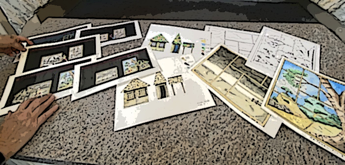
How, specifically, do we capture a comic-book feel of Oz for our play? The director had already established that she needed a visual background for Kansas up stage right and the same for Oz up stage left. So, I designed two giant comic book “pages” to sit upstage – one landscape view for Kansas (since the Kansas landscape is very horizontal) and the other vertical (since this piece of Oz has mountains).
In our play, we start with a blank stage. (Okay, there is a table, lectern, and a couple of chairs, but no “scenery.”) It’s not until scene 3 that actors start to bring in pieces of scenery. We start with two large skeleton frameworks which are the empty comic “pages” of Kansas and Oz.
Over the next four scenes, we fill in the comic book cells with black and white line drawing panels that represent the two locations. Kansas is a prairie landscape with storm clouds, while Oz is mountainous with – you guessed it – a yellow brick road. (Well, a black and white version, at this point.)
Now we’re ready for the Act I finale. This is where we first see Dorothy’s “house.” It is made of cardboard with some magic marker sketches representing the rehearsal version of these set pieces. The dancers tear the house apart during the storm and then reassemble it as they move it from the Kansas side of the stage to the Oz side in this big musical number.
Close curtain. Intermission.
When the curtains open on Act II, the black and white sketches are gone, replaced by full colour – muted tones for Kansas, bright primaries for Oz. The set does a few “tricks” during Act II and when we get to the finale, Dorothy’s “house” is now in full colour as well—representing the design process moving from sketches to fully realized scenery.
It’s been a lot of fun discovering our Oz world and working together with such an enthusiastic and cooperative production team. I’m grateful for the opportunity to contribute to this exciting project.
Kairiin Bright holds a Master of Fine Arts degree from the University of British Columbia and is a member of Associated Designers of Canada. She has worked in theatres across Canada designing sets, lights and costumes and has taught stage design at Concordia University in Montreal. During her years in Quebec, she designed both English and French language productions. She now lives in Smiths Falls where she produces short films and online courses that help teach how to combat financial crime.
Tickets to The Wizard is… Odd!? may be purchased here: ticketsplease.ca
© 2024 Susan Macaulay. I invite you to share my poetry and posts widely, but please do not reprint, reblog or copy and paste them in their entirety without my permission. Thank you.
